“A clean, accessible visualization that explores how art and technology relate—what’s most popular, how they co-occur, and how trends change over time.”
Overview
The Earth Quake is a data visualization project that explores the relationship between art and technology. The visualization highlights which artworks/movements and technologies are most popular, how they intersect, and how interest evolves over time. Visuals are built with D3.js using data sourced from the Artsips API.
Visualizations used
-
Heat map
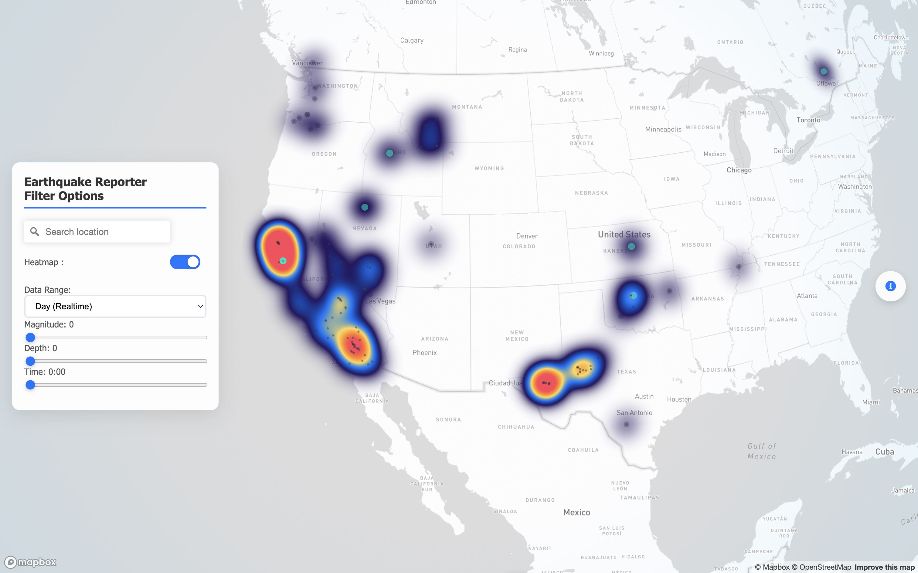
Showing the distribution of earthquake locations along with their magnitude and depth. -
Bubble map Chart
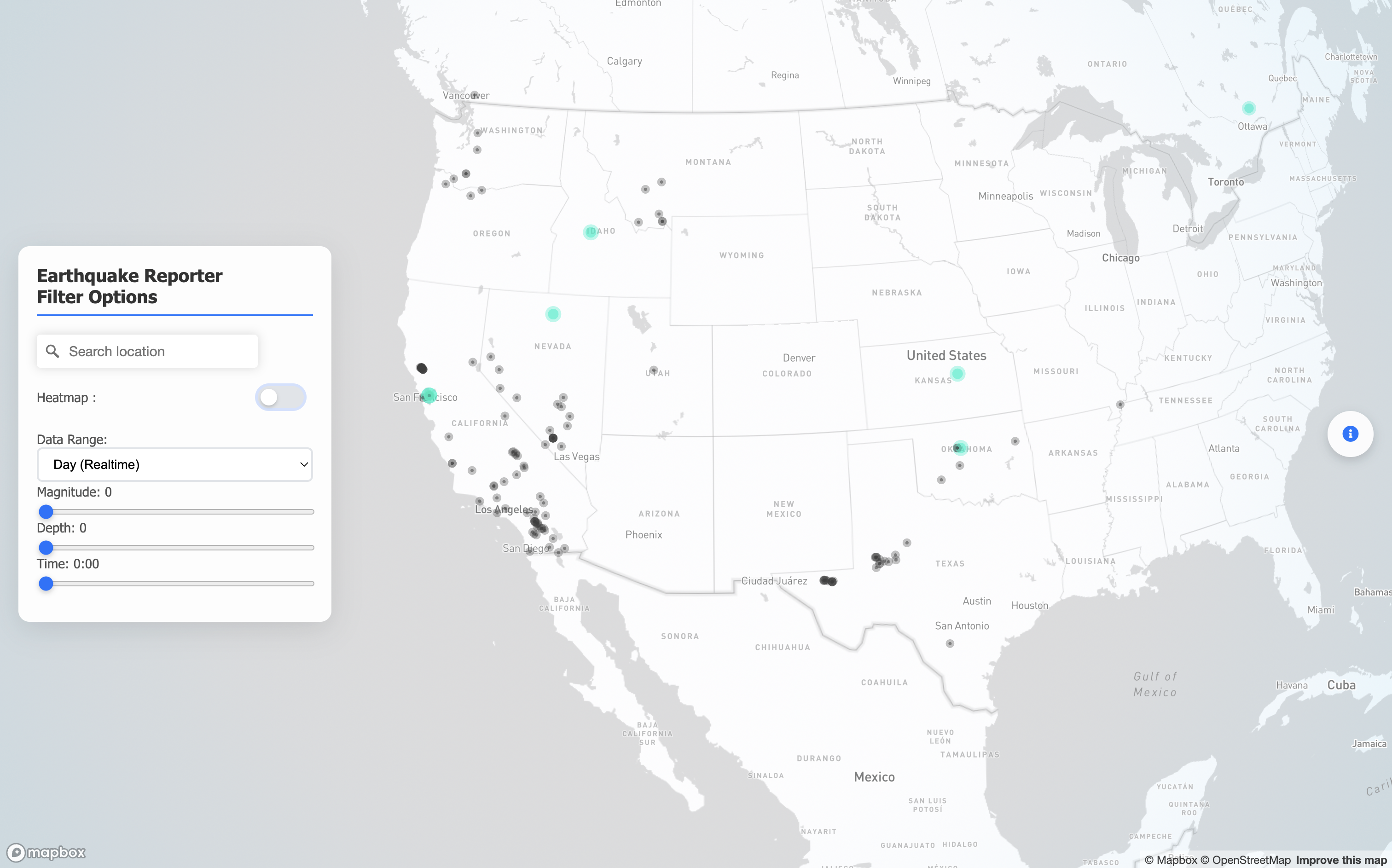
Illustrating the frequency of earthquakes in different locations around the world.
Process
Data — Queried the Artsips API; normalized names; deduplicated entries; computed popularity and recency metrics.
Design — Sketched layouts and interaction patterns; defined a consistent color/typography system; iterated D3 prototypes for bars, network, and timeline.
Interaction — Hover/tap tooltips, filter chips for movement/technology/period, responsive reflow for mobile and desktop.
Accessibility — High-contrast palette, clear labels, keyboard focus, and reduced-motion friendly animations.